Last week, all eleven new Heilo colors arrived. What fun! Delving into that colorful pile of woolly goodness brought back memories of leaping into piles of freshly-raked leaves and revelling in nature’s colors or filling goodie bags from the candy store’s long bank of jelly bean bins and delighting in all the tasty combinations. Oh, the colorwork possibilities!
Two of the “new” colors are returning friends: you’ve seen white 0010 and wine 4246 before.
They’re old favorites which were discontinued for a while, only because they were so beloved that they were sold out. Now, they’re back; hopefully, for a nice, long stay.
Some of the allegedly new colors will seem very familiar – even suspiciously familiar!
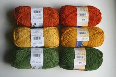
From the top left, we have the new orange red 3237 – a slightly less saturated version of old, discontinued burnt orange 3418, to the right. In the middle, on the left, we have the new sunglow 2126 – again, a slightly less saturated version of old, discontinued gold (aka goldenrod) 2427. On the bottom, that’s the new asparagus 9145, which is – you guessed it – slightly less saturated than the old fern green 9155. Smart cookies like you see a pattern developing here, yes?
So, why move to the softer, less saturated colors? First of all, they’re more wearable. For instance, if you walk down Park Avenue in a sweater knit entirely out of the old gold 2427, people might try to flag you down for a ride; make it out of the softer sunglow and not only will folks stop calling you “taxi!!!!”, but you’ll also have a more flattering sweater that will go with more things. Plus, the sunglow, orange red and asparagus are still lively enough that they’ll happily “pop” in your colorwork. And, they’ll even play nicely with some of the truly new, more muted colors, below:
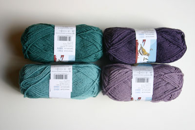
Here we have petrol 7062 (above left), light steel blue 6642, (bottom left), plum smoke 5062 (top right) and orchid 5042 (bottom right). Wonderful, wonderful colors, but rather odd names. Yes, that really is a photo of yarns that really do have those official Dale of Norway color names. But, if you’re surprised by how much green there is in light steel blue, or you’re wondering if all the orchids in Norway are as greyish looking as this orchid, you’re not alone. Apparently, these colors were given their English names many months ago, by someone who had only seen a pdf of a digital photo showing these colors; it was much later that the actual yarns hit the American shore and American eyes.
Which brings me to the ultimate “great color, weird name” mismatch:
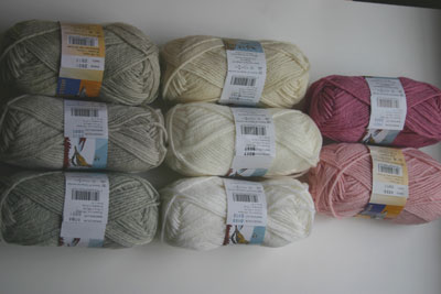
On the far right, at the top, we have…drumroll, please…dark salmon 4624. Oh, yes we do! Whadyamean, it’s there, really, it’s right there, right above the ever-popular blossom pink 4203. Oh, okay, so that color might have a lot more in common with your raspberry sorbet dessert than your (dark) salmon appetizer. And, yes, you would be entirely in the right to return any Norwegian salmon that showed up at your table looking that pink. Perhaps it’s more the color of that lovely rose between your date’s teeth? Anyway, it really is a beautiful color. Just stick with the numbers and you’ll do fine.
When they don’t have to rely upon distorted, third-hand, transatlantic photos, it seems the folks at Dale US can quite adeptly name their colors. The middle color on the left is their new mist 2425, which came out last year in Baby Ull so, apparently, they had a better peek at that one before naming it, for it truly is reminiscent of the lightest grey seen in the mist on a foggy morning. Just for comparison sake, it’s sitting between the old standby, light sheep heather 2931 (top) and the classic sand heather 0004 (bottom). For further comparison, in the middle, we have natural 0020 on top, off-white 0017 (newly discontinued) in the middle and the happily-returning white 0010 on the bottom. “White” – hmmm, now there’s a color name we can agree upon!







I wonder if DON surveyed their inventory and tracked which colors were selling and why. The trend toward desaturated colors could come from knitters wanting more wearable or sophisticated colors, or maybe from a Pantone research recommendation. Who knows? I’m just glad there’s a bigger, wider range of color!
I was told (a year or two ago) that they do study trend reports, including things like Pantone reports, and I imagine selection of new colors has much to do with that. Some of the new color selection must be done with color pairing (for colorwork knitting) in mind, too, so that new additions will work well with the existing color palette and offer harmonious gradations – a consideration that some yarn companies probably don’t have to focus on to the extent that DofN, and other companies with broad ranges of colors within yarn lines, will. Although it’s nice to feel our color selections are stylish, I don’t think the individual knitter should feel they must be working with the latest palette for stranded knitting. One of the wonderful things about colorwork knitting is that there’s always a way to use any type of color somewhere – colorwork is not so dependent upon the latest fashion palette to look fashionable. Even without the exact “hottest” color yarn, you can sometimes get the same effect by combining a few neighboring colors. And there’s always something wonderful that can be done, even with blasts from the past hiding deep in the stash. Sometimes a smattering of a wildly contrasting color is just the ticket for enlivening a piece!
Specific to DofN, I know that they have been making more of a distinction between their Heilo and Falk palettes. It used to be that the vast majority of Heilo colors were duplicated in Falk. Now, you’ll see more of a distinction, with Heilo featuring more muted “adult” colors and Falk featuring more bright, clear “kids” colors, with an overlap of the old standbys between them, to give adults looking for superwash some good options.